FARBIMPULSE
The online magazine for color in science and technology

Red feels like a square and blue feels like a circle
September 9, 2005 - Source: www.farbimpulse.de
When the color determines the shape: The Bauhaus teachers Johannes Itten and Wassily Kandinsky assigned colors a geometric form and expressive effect. The artists and teachers of the Bauhaus school intensively studied the relationship between color and form in the 1920s. The search for the right color as a means of design and orientation can be found throughout the entire Bauhaus school. The two Bauhaus teachers Johannes Itten and Wassily Kandinsky developed color schemes and color systems with their students that are still valid today. On this basis, they investigated the connection between color and form and assigned certain properties and characters to the colors.
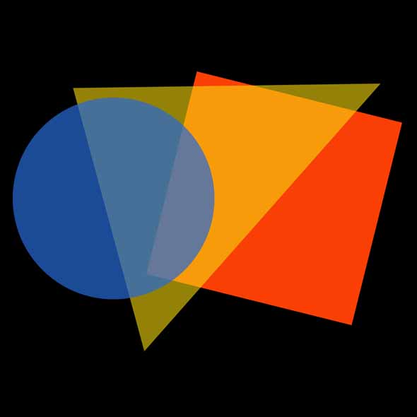
The circle blue, the square red and the triangle yellow: Form and color were closely related for Johannes Itten.
At first, Itten's studies focused on identifying and designing color contrasts and the relationships among colors. The types of contrast he investigated and which are widely known have influenced design, art and architecture to this day. In his book "The Art of Color", the artist also describes the expression and effect of colors, and in his "expressive color theory“, he begins to assign certain characters and abstract, geometric forms to individual colors.
For Itten, the color red represents physical substance. It seems static and heavy. He therefore assigns the static form of the square to the color red. Yellow appears fierce and aggressive, has a weightless character and, according to Itten, stands for the mind and thinking. The triangle matches this character. The color blue, on the other hand, appears round according to Itten. It evokes a feeling of relaxation and movement and stands for the "spirit moving within itself", as he describes it. The circle corresponds to the color blue, as it is a symbol of "constant movement". In his so-called color type theory, Itten later transferred these three color characters to the human character types and the associated explainable color preferences of each person.
However, the painter was not only exploring the form of the three primary colors red, yellow and blue. He also derived corresponding geometric forms for the secondary colors orange, green and violet, which lie in the color circle between them. Thus between the red square and the yellow triangle is the orange trapezium. In the transition from the blue circle to the red square, an ellipse is created representing the color violet and between the yellow triangle and the blue circle a spherical green triangle with rounded corners is formed. If color and form are in agreement in their expression, their effect adds up, according to Itten.
The Expressionist painter Wassily Kandinsky was also interested in the question what character certain colors have and in which forms they have the greatest effect. As in the case of Itten, the three primary colors red, yellow, blue and their assignment to the basic forms of square, triangle, and circle formed the starting point for his color theory. Kandinsky pursued this further and juxtaposed the three basic colors with three-dimensional bodies: The square became a red cube, the triangle a yellow pyramid and the circle corresponds in its spatial consistency to the blue ball.
Kandinsky examined the psychological effect of color with so-called opposing color pairs. He described the effect of yellow as eccentric and prominent, whereas blue behaves concentrically and receding. As a synesthete, Kandinsky not only assigned characters to the colors, he could also hear them. Thus, the color yellow sounds to him in high and penetrant tones, while the opposing color blue sounds deep and dark. In his abstract and colorful paintings, he created a connection between music and colors. They challenge the viewer to find analogies in what can be heard. The painter chose titles such as "Concert" and "Fugue" for his artworks or called his series "Composition and Improvisation". It is assumed that many of these paintings reflect Kandinsky's color sensations when listening to pieces of music.
The mutual support of form and color came from the desire to find valid design principles, which were universally applicable in art and design and were effective means of communication. In the Bauhaus school, theories about the connection between color and form were implemented in numerous graphic and interior designs, for example in the application of graphic orientation systems, poster design, wall design and furniture design.
This is a translation of the original German article: „Rot wirkt quadratisch und blau wirkt rund” from the online magazine FARBIMPULSE.
© Brillux GmbH & Co. KG (www.brillux.de)